Breaking the Vibe-Coding Template with Design Fundamentals
Vibe coding produces generic AI-generated UI by default; this practical guide shows how FutureX applies typography, color theory, and visual hierarchy to create unique web design.
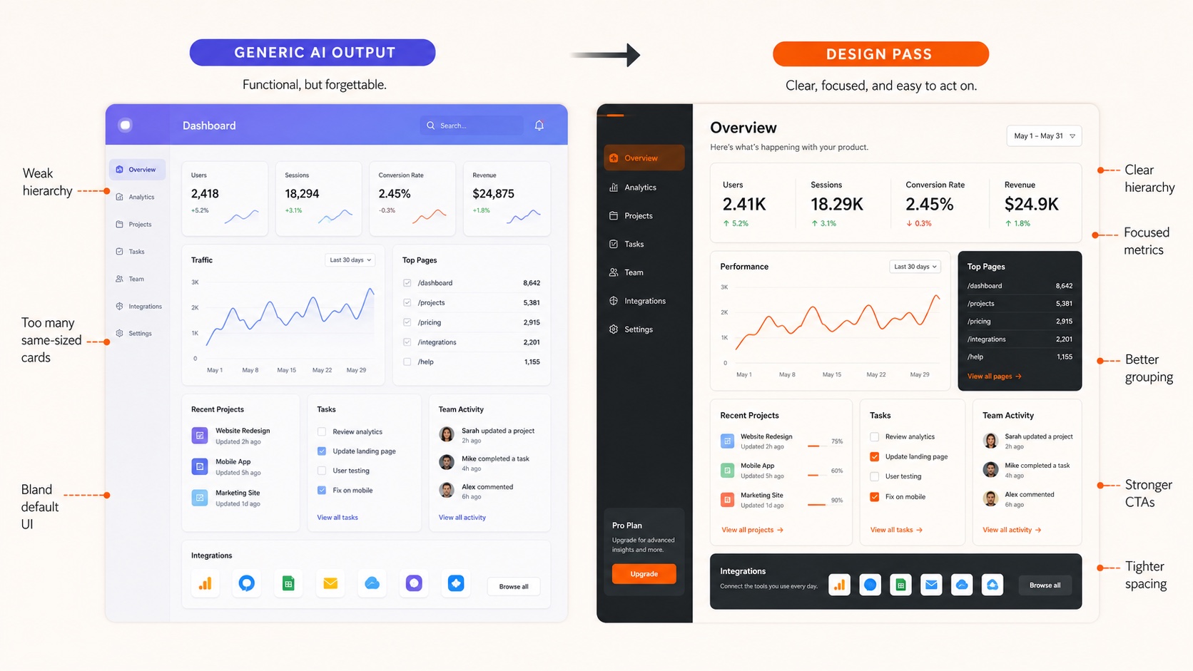
Vibe coding has made it trivially easy to ship an app in an afternoon — and just as easy to make it look like every other AI-generated UI on the internet. Open any vibe-coded project and you will find the same Inter font, the same Lucide icons, and the same blue-purple gradient on the hero button. That sameness is not an accident. It is the statistical center of gravity of training data built from millions of identical templates. FutureX takes a different path: it treats design fundamentals — typography, color theory, visual hierarchy — as first-class engineering constraints rather than decorative afterthoughts. This guide shows how to break the template, with concrete techniques you can apply in your own AI-assisted workflow.
Why vibe coding defaults to sameness#
AI-generated UI does not have taste; it has probability. When you ask a model to "create a landing page," it samples the most common patterns in its training data: Inter for text, Lucide for icons, a blue-to-purple gradient for primary actions. These tokens appear so often that they become the mode of the distribution.
The problem is not that these defaults are bad. They are neutral, which is worse — they signal nothing about your product. A generic UI does not offend anyone, but it does not differentiate either. In a market where every competitor is using AI to ship faster, the UI is the battleground. If your vibe coding output looks like everyone else's, you have outsourced your product identity to the same statistical average as your competitors.
FutureX breaks this loop by explicitly constraining the design space before generation starts. Instead of asking for "a modern SaaS landing page," you define a design system — type scale, color primitives, spacing rhythm — and let the model work inside it.

Source: thecrit.co
Typography as a design tool#
Inter is a good typeface. It is also the default in a hundred thousand AI-generated UIs, which means it carries a strong generic signal. The fastest way to make a vibe-coded site feel intentional is to replace the default type system.
Build a type scale, not a font choice#
Most vibe-coded UIs use one font at three or four sizes and call it a day. A real type system defines a modular scale — something like 12, 14, 16, 20, 28, and 40 px — with clear roles for each step: caption, body, subheading, display. FutureX generates this scale from your content hierarchy rather than from available presets, so headings and body copy have a measurable relationship instead of an arbitrary one.
Pairing with purpose#
Pairing a neutral sans with a distinctive display face changes the entire feel of a product. A monospace for code samples, a grotesque for headlines, a serif for editorial sections — each pairing says something specific about the product. FutureX evaluates pairings by contrast in weight, width, and x-height, then verifies readability at the sizes your layout actually uses. The goal is not to escape Inter for the sake of novelty; it is to choose type that carries meaning.
Color theory beyond the purple gradient#
The blue-purple gradient is the calling card of AI-generated UI. It reads as "tech" without saying anything about your product. Color theory gives you a framework for escaping it.
Work in hue, saturation, and lightness#
A palette is not a list of hex codes; it is a relationship between hues. FutureX builds palettes using HSL logic: pick a primary hue based on product intent, then derive supporting colors by rotating the hue wheel and adjusting saturation and lightness. The result is cohesive because the colors follow a defined relationship rather than a random selection of "brand-ish" blues.
Neutrals are the anchor#
Most generic UIs define one neutral — gray-500 — and call it done. Intentional design defines a neutral ramp with a distinct temperature: a warm gray, a cool slate, or a tinted neutral pulled from the primary hue. These choices ground the palette and make accent colors feel deliberate. FutureX applies the same temperature logic to borders, backgrounds, and text so the UI stays consistent from the first pixel to the last.
Contrast is accessibility is design#
Color choices succeed or fail at the boundary of readability. FutureX checks contrast ratios at every step, not as a compliance pass but as a design constraint. When a color misses WCAG thresholds, the model adjusts lightness and saturation instead of falling back to black text on every background. Accessible contrast is not a restriction; it is what makes a palette usable in the first place.
Visual hierarchy: directing attention with intent#
Vibe-coded UIs often flatten everything to the same level: every section gets a heading at the same size, every card gets the same border, every button is equally loud. The design fundamentals of hierarchy — size, weight, spacing, and color — exist to rank information visually.
FutureX applies hierarchy in a structured order. First, it identifies the single primary action on each page and gives it the highest-contrast treatment. Secondary actions drop to outline or ghost styles. Tertiary information is muted by size and color, not by adding more borders. Spacing follows the same logic: white space groups related elements and separates unrelated ones, replacing the "everything gets a card" pattern with a rhythm that matches the content structure.
The key shift is treating density as a design variable. Generic UIs are uniformly dense — every section packed with equal visual weight. Intentional UIs vary density: a sparse hero, a dense data table, an airy testimonial grid. FutureX paces that variation so the user's eye moves through the page the way the product wants it to.
How FutureX applies design fundamentals in practice#
The practical workflow matters more than the philosophy. Here is how FutureX embeds design fundamentals into an AI-assisted build loop.
Constrain the brief, not the output#
FutureX does not ask for "a nice-looking UI." It generates from a written design brief that specifies type scale, color relationships, and hierarchy rules. The model then produces visual output that fits those constraints, so the result expresses your product's intent rather than the median of its training set.
Review for patterns, not pixels#
FutureX looks for the telltale patterns of generic AI-generated UI: Inter, Lucide, blue-purple gradients, centered hero sections with three feature cards, and a uniform border radius everywhere. When it finds them, it proposes a design-fundamentals alternative — a different type pairing, a palette anchored in a non-obvious hue, a hierarchy that leads with something other than a gradient button.
The critique loop#
AI-generated UI does not improve in a single pass. FutureX runs a generate-evaluate-refine loop, and design fundamentals give that loop concrete criteria. Is the type scale coherent? Do the neutrals have a consistent temperature? Does the primary action dominate the viewport? Each evaluation produces specific changes, not vague suggestions to "make it pop."
Conclusion#
Vibe coding removed the friction from building software, but it also removed the friction from looking like everyone else. The escape is not to abandon AI — it is to give it better constraints. By applying typography, color theory, and visual hierarchy as design fundamentals, FutureX produces unique web design that reflects a product's actual intent instead of the statistical average of a training set.
The next time you open a vibe-coded project and see Inter, Lucide, and a purple gradient, you know exactly what happened: nobody made a deliberate design decision. With FutureX, every pixel is the result of a decision — and that is the difference between a template and a product.
Related reading

From Prompt to Production: The FutureX Playbook
A step-by-step FutureX playbook for non-developers that turns a natural language prompt into a production-ready SaaS while avoiding the debt and security traps of vibe coding.
FutureX5 min read
The Reality Check: What Vibe Coding Still Doesn't Do for You (and How FutureX Fills the Gaps)
An honest look at where vibe coding breaks down and how FutureX's iterative, human-in-the-loop workflow covers debugging, security, and scaling.
vibe coding5 min read
I Used FutureX to Build a Bot in 3 Days: Costs and Lessons
A hands-on cost analysis of building a FutureX bot in three days, including the debugging traps, wasted API calls, and the exact process changes that would have cut the bill in half.
FutureX9 min read